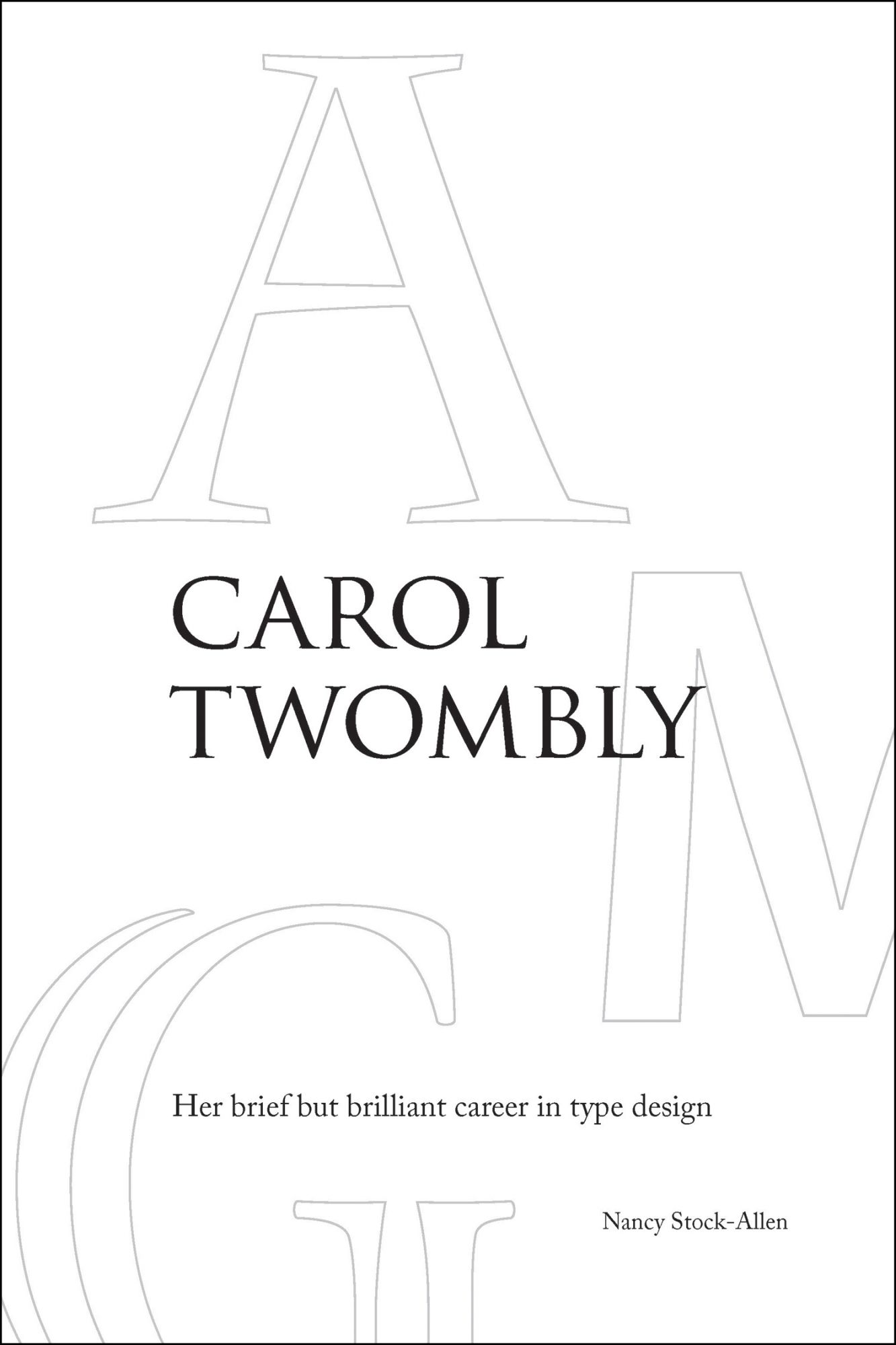
The book begins with a welcome overview of women type designers; although women were employed in type production from at least the 19th century onward, the book reports the earliest documented design by a woman was perhaps Belladonna Kartenschrift in 1912, by Hildegard Henning for a Leipzig foundry. The careers of Gudrun Zapf von Hesse, Fiona Ross, Zuzana Licko, and many others, are all discussed. But as the title indicates, the book’s subject is Carol Twombly (1959–), an extended case study of a designer’s career as digital typography came of age.
Following the introduction, the book contains two main parts: Twombly’s student years at the Rhode Island School of Design (RISD) and Stanford; and her career at Adobe. A third section presents samples of her released typefaces, with commentary from Twombly on each, written for the book.
In each section, Stock-Allen describes the relevant designs at length, with attention to typographic detail. Many illustrations are included, from screenshots of font design software to photographs, from marked-up proofs of draft letterforms to samples of the final type.
Of particular interest to the TeX world is the extensive section on Twombly’s graduate studies at Stanford, as one of the inaugural (and, as it turned out, only) class in the Master’s program in digital typography. The program was promulgated by Donald Knuth and co-chaired by Charles Bigelow, who had met Twombly as an undergraduate at RISD and invited her to Stanford.
Her time there is covered in considerable detail, including classes, conferences, the many visiting typographic luminaries, the computer science vs. artistic challenges and collaborations, and culminating in implementing Hermann Zapf’s Euler design, a project widely known in the TeX world.
Following Stanford, Twombly worked at Adobe for a decade, spanning the era from the beginnings of commercial digital type to fonts becoming a commodity item. Stock-Allen concisely but informatively describes both the changing typography milieu as desktop publishing became common in the world, and Adobe’s changes as a corporation.
Twombly’s first designs for Adobe were the display faces Lithos, Charlemagne, and Trajan, all of which met with commercial success, followed by the Adobe Caslon Pro revival. She was then involved with the Multiple Master project at Adobe, for essentially its entire duration. Her last project for Adobe was the Chaparral Multiple Master family, a humanistic slab serif which, unusually, had design axes for changing serifs (wedge to slab), and optical size, as well as the common weight and width axes.
Stock-Allen ends the main text with comments from several noted typographers and historians on the significance and legacy of Twombly’s work.
As a postlude, Twombly retired from type design (and city living) after leaving Adobe, and now pursues other artistic interests in a small town near the Sierras. As Stock-Allen observes, rhythm and writing remain an innate part of her art.
The book is superbly designed and typeset by the author in Twombly’s Adobe Caslon Pro and Adobe Trajan.

